Throne: Kingdom at War: The Good & The Bad

Throne: Kingdom at War is a medieval themed browser-mobile strategy game from Plarium. Players get to build up their own city and army and go up against other players in PVP. It’s a feature packed, beautifully designed MMO, but let’s take a look at both the best and worst things about the game in our Good & Bad article.
THE GOOD
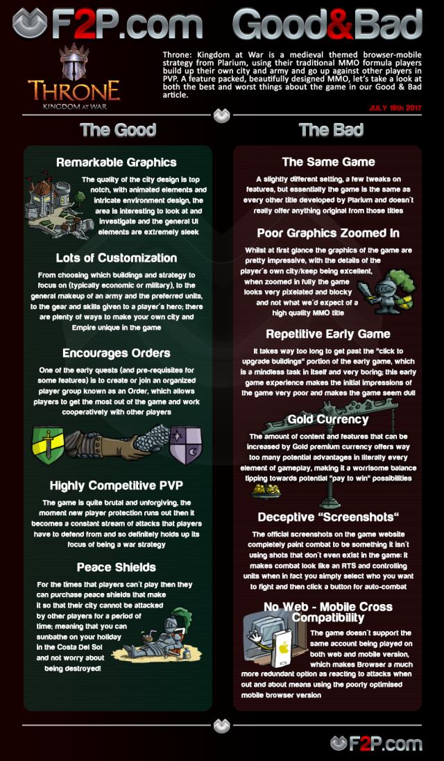
Remarkable Graphics - The quality of the city design is top notch, with animated elements and intricate environment design, the area is interesting to look at and investigate and the general UI elements are extremely sleek
Lots of Customization - From choosing which buildings and strategy to focus on (typically economic or military), to the general makeup of an army and the preferred units, to the gear and skills given to a player's hero; there are plenty of ways to make your own city and Empire unique in the game
Encourages Orders - One of the early quests (and pre-requisites for some features) is to create or join an organized player group known as an Order, which allows players to get the most out of the game and work cooperatively with other players
Highly Competitive PVP - The game is quite brutal and unforgiving, the moment new player protection runs out then it becomes a constant stream of attacks that players have to defend from and so definitely holds up its focus of being a war strategy
Peace Shields - For the times that players can't play then they can purchase peace shields that make it so that their city cannot be attacked by other players for a period of time; meaning that you can sunbathe on your holiday in the Costa Del Sol and not worry about being destroyed!
THE BAD
The Same Game - A slightly different setting, a few tweaks on features, but essentially the game is the same as every other title developed by Plarium and doesn't really offer anything original from those titles
Poor Graphics Zoomed In - Whilst at first glance the graphics of the game are pretty impressive, with the details of the player's own city/keep being excellent, when zoomed in fully the game looks very pixelated and blocky and not what we'd expect of a high quality MMO title
Repetitive Early Game - It takes way too long to get past the "click to upgrade buildings" portion of the early game, which is a mindless task in itself and very boring; this early game experience makes the initial impressions of the game very poor and makes the game seem dull
Gold Currency - The amount of content and features that can be increased by Gold premium currency offers way too many potential advantages in literally every element of gameplay, making it a worrisome balance tipping towards potential "pay to win" possibilities
Deceptive "Screenshots" - The official screenshots on the game website completely paint combat to be something it isn't using shots that don't even exist in the game: it makes combat look like an RTS and controlling units when in fact you simply select who you want to fight and then click a button for auto-combat
No Web - Mobile Cross Compatibility - The game doesn't support the same account being played on both web and mobile version, which makes Browser a much more redundant option as reacting to attacks when out and about means using the poorly optimised mobile browser version
Do you have any thoughts with the article? Do you have any of your own Good & Bad points you think should be added? Give us your feedback in the comments!


